How simplicity, clarity, and visual translation help shape real-world scientific impact
Category: Accessibility
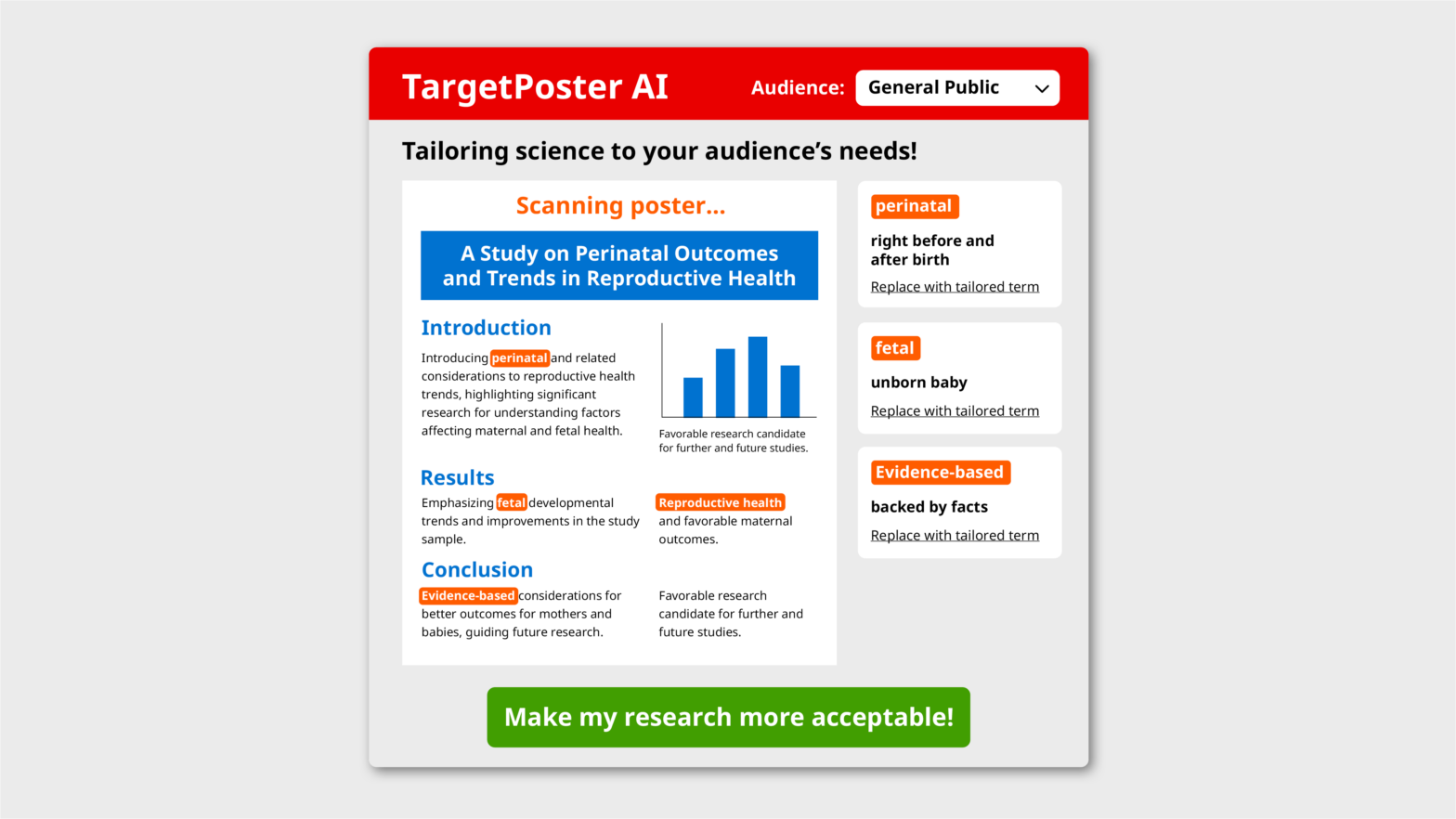
TargetPoster AI—Tailoring Science to Your Audience’s Needs!
Scientific posters are like any other form of communication—they are designed to attract and convince your target audience.
Before designing your poster, it also helps to consider who your audience is and what their preferences might be.
To make this process easier and save you time in your already busy schedule, I spent a few hours developing an AI tool to help you customize your poster for different audiences.
April Fool!
Thank you for your interest in my tool! I haven’t developed one yet, but I believe others have. If you’re interested, please leave a comment, and I’ll look into it and let you know.
Make People Care: creating lasting connections through design
In the world of design, making a message resonate isn’t just about aesthetics; it’s about connection. How do we create visuals that bridge the gap between the one conveying a message and the audience meant to receive it?
What is light-dark contrast and how can it be used design figures and infographics?
In this article, you will learn about one of the most important methods of visual design: using light-dark contrast to create clear and striking figures and infographics.
5 tips to make your text more legible
A legible text is like a smooth, well paved, visible path that gives you clear directions.
How to use red and green safely together
In this article, I give you some suggestions on how to use red and green in a “safe” way.
Is using plain language unprofessional?
When working with stakeholders who are experts in their field, I sometimes experience some anxiety when I use plain language to describe their work: Will this sound less professional? Does plain language describe the complexity and hard work behind it?


