
A legible text is like a smooth, well paved, visible path that gives you clear directions.
Reading a legible text is like walking on a path without having to take care of obstacles, potholes or the next turn. While walking, you can listen to a podcast or have a deep conversation. While reading an easy-to-read-text, you can easily dive deep into the content of the text.
For thousands of years, “typesetting” – the expert term for arranging letters and words together to a create an optimal reading experience – was done by trained professionals in a highly standardised way that ensured texts in books and newspapers were easy to read.
Today, everyone who has access to a computer and internet, can create and publish texts. These digital tools, however, still require some skills from the user to create a text that is easy to read.
There are many emails, books, posters, websites, apps and social media posts that are hard to read and to navigate, or contain information that is just overlooked. What if it’s not just annoying, because you need to repeat the information all over again? Or frustrating, because you can’t get your message across? What if it’s information that’s important for the audience’s health? An information that can be health threatening, if overlooked?
Your message needs to be seen – make it legible!
Avoid the following pitfalls and follow the tips on how to make your text easy to read.
Low contrast
Fog and falling darkness make it hard to see the path clearly.

So does a low contrast of your text.
TIP no. 1: Use a high contrast
A high contrast makes reading effortless.
Forced justification
Potholes make your ride bumpy.
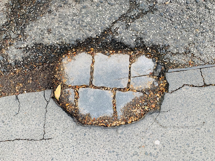
So does forced justification.
TIP no. 2: Use aligned text.
Most languages use left-aligned text. Some, e. g. Arabic, Hebrew or Farsi, use right-aligned text.
Not using paragraphs
This is a well paved and clearly marked, but monotonous road. Especially when you are tired, you need regular breaks.

This LinkedIn post text uses high contrast and is justified. But it is still a bit tiring to read.
TIP no. 3: Use paragraphs regularly.
Paragraphs are crucial for digital screen texts and low literacy audiences.
Too much or too little line spacing
The right line spacing is like the right size of the steps of a stairway.

Too much line spacing requires more effort from the eyes to jump from one line to the next.
Too little line spacing makes it hard for the eye to distinguish the lines from each other.

TIP no. 4: Choose a balanced line spacing.
A balanced line spacing makes it easy for the eye to distinguish the lines from each other. They are also not too separated from each other to ensure a smooth reading flow.
Line length too short or too long
Using a short line length is like walking on a small, overgrown path. It’s hard to see the path and arduous to follow it.

A short line length makes a text disjointed.
A line length that is too long, is like walking in the desert with no clear path – it’s tiring and you can easily get lost.

Did you find these tips helpful? If yes, this is just the beginning – there’s more to come 😊!
Gut zusammengefasst!
Danke, lieber Axel!
Liebe Shau Chung,
man merkt, dass du perfekt in Bildern denkst und dass dir Lesbarkeit sehr wichtig ist – deine wertvollen und hilfreichen Beispiele bleiben mir dadurch super im Gedächtnis. Danke für diese Gegenüberstellungen, ich freue mich auf mehr. 😀 ✒️ 🔎
Liebe Grüße
Nicole
Danke sehr, liebe Nicole 😊!
Hi Shau Chung, I love your analogies with pictures. That’s how your tips really stick. I really hope, there’s more to come!
Thank you so much, Djuke 🤗!