
Designing figures and infographics to convey the results of your research or to inform and influence your audience is a task that requires a significant amount of time and skill.
But especially when addressing an audience that isn’t involved in your subject, investing in elaborate design is crucial to effectively reach your audience.
In this article, you will learn about one of the most important methods of visual design: using light-dark contrast to create clear and striking figures and infographics.
The basics
Colour shades and tints
Colours come in different tints and shades. A colour shade is mixed with black, and a colour tint is mixed with white. The more black a colour contains, the darker it appears, while the more white a colour contains, the lighter it appears.
Light-dark contrast
Light-dark contrast is the variation in lightness or darkness between colours. The higher the light-dark contrast between two colours, the easier it is to distinguish them.
On the other side, the lower the light-dark contrast, the harder it becomes to tell the elements apart, as they blend together more smoothly.
How to use light-dark contrast to make your design more clear
When designing figures and infographics, clarity of information comes first. Why? Because, a lack of clarity impedes access to your information.
The information or data you want to convey is the heart of your figure or graphic – hence, use light-dark contrast very consciously to achieve clarity. Here are the two main approaches.
Highlight what is important
The more information a figure contains, the longer it takes for your audience to navigate through and process it.
You can enhance the pace, prevent misunderstandings, and sustain your audience’s attention by giving them a guiding hand. Do this by showing them what is essential – by highlighting the main focus using light-dark contrast.
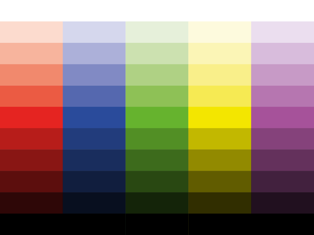
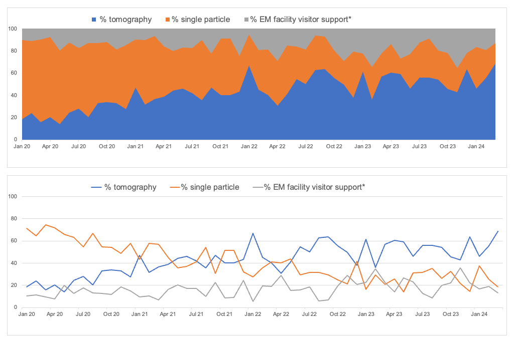
When you take one step back and observe the example above with a blurred sight, you can notice that the color palette appears slightly three-dimensional. The colours in their purest form – not mixed with black or white – stand out the most.
You can use this aspect to prioritise your visual information. Employ pure colours for the most crucial information, such as the central focus, to make it stand out. Use darker or lighter colour shades or tints for the less important information, like details providing necessary context, allowing them to step back.
Make your information legible
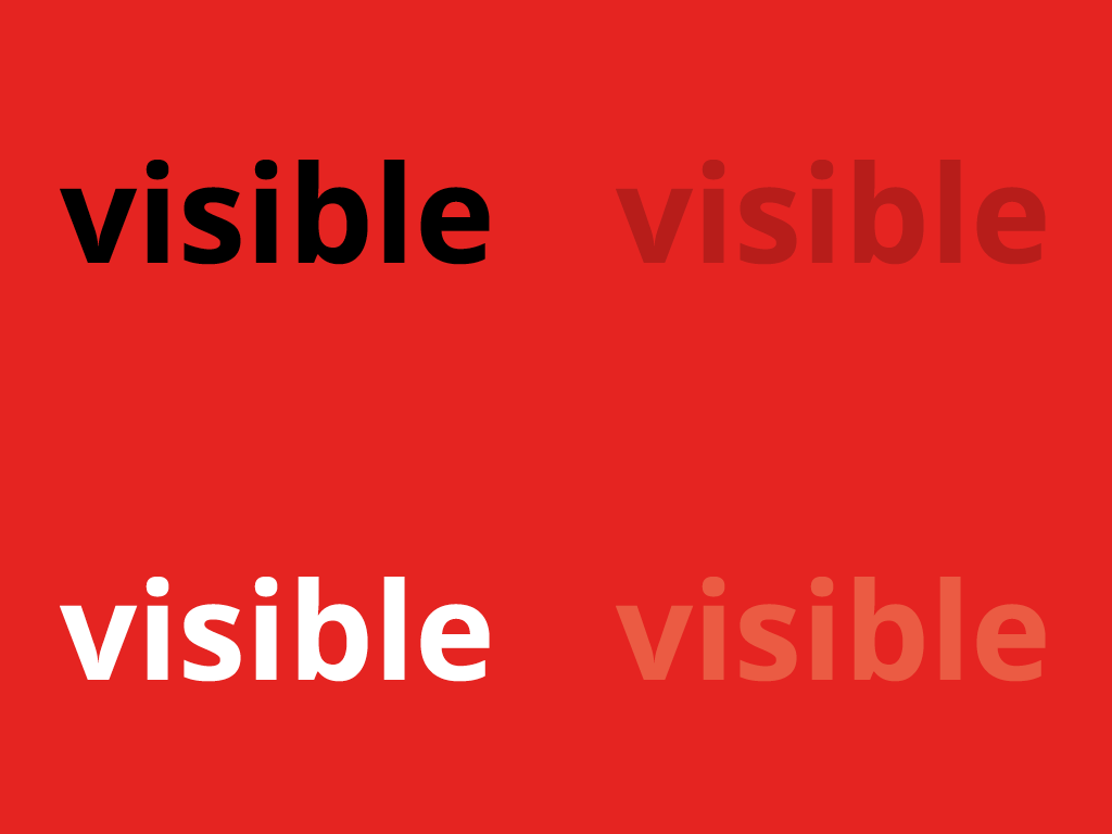
Low contrast makes it hard to access visual information for vision impaired persons, but also when
- the lighting is insufficient (e.g. shadow, darkened room)
- the lighting is two strong (e.g. strong sun or beamer light);
- there is a lot of distraction, such as noise, motion, and people wanting to talk to you;
- you need to do several things at once;
- you are stressed or tired.
Therefore, to improve legibility, a high light-dark contrast is one of the most effective visual design methods.
Examples
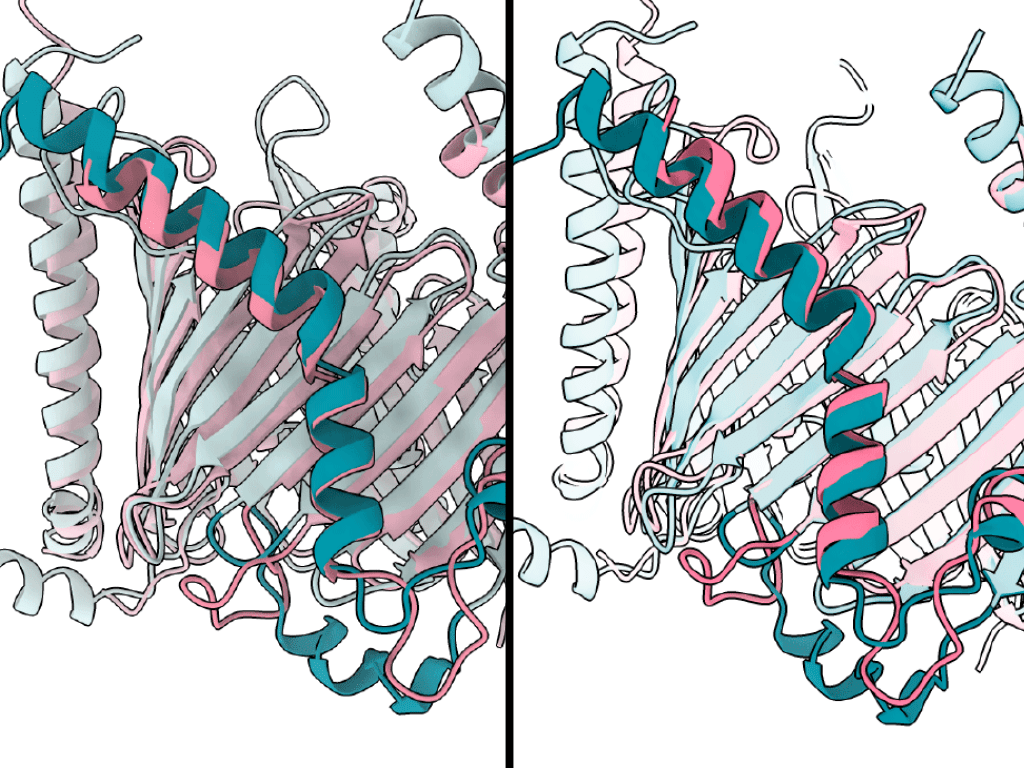
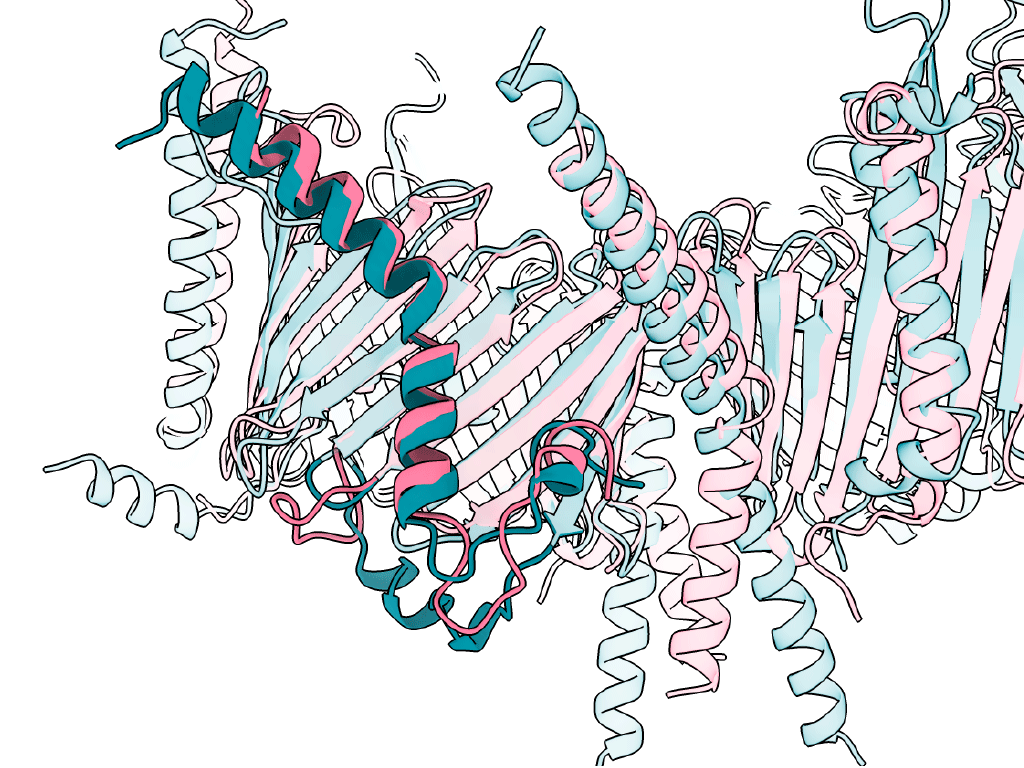
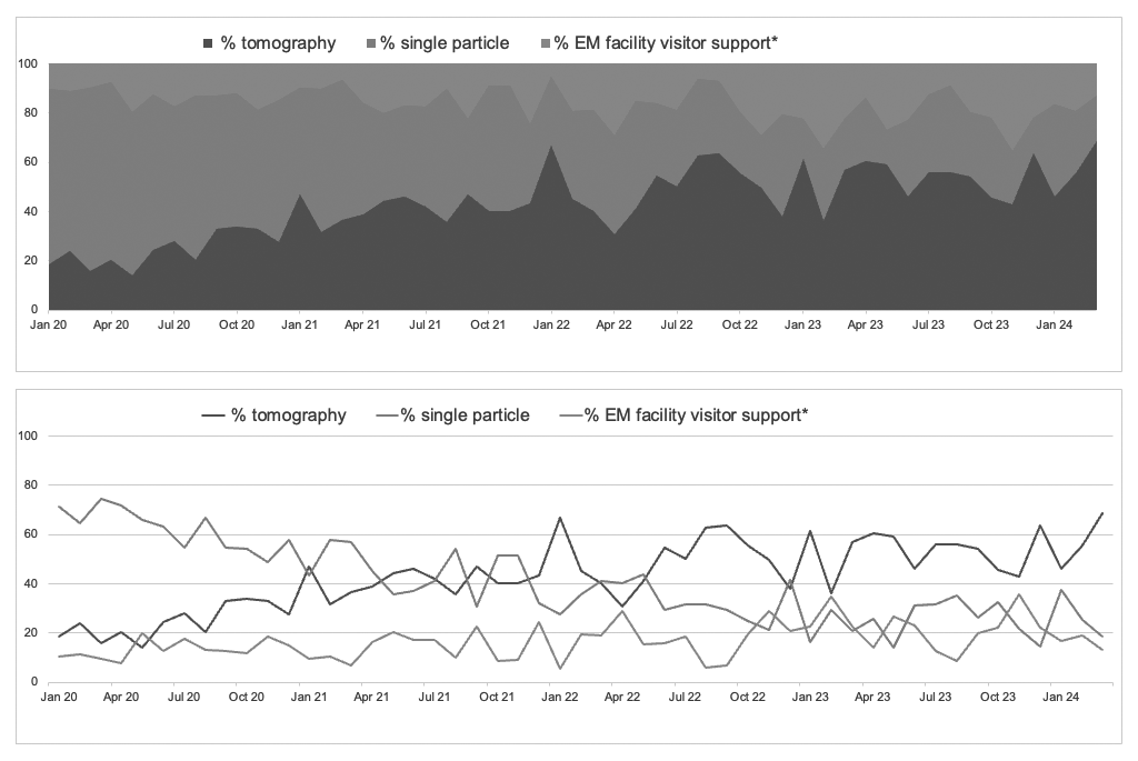
Left: Early draft of a figure detail. Right: Figure detail with increased light-dark contrast. By increasing the contrast of the figure, it becomes much clearer what the focus of the figure is (figure: Pamela Ornelas).
How can I judge, if the contrast is high enough?
There are two tricks you can apply to judge if the contrast is high enough:
1. Imagine the figure without colours.
If you don’t just want to depend on your imagination, but want to check your contrast by converting your figure to greyscale colour mode, you can use a tool that simulates colour blindness. There are plenty of tools. Some of these are:
https://www.toptal.com/designers/colorfilter
https://www.color-blindness.com/coblis-color-blindness-simulator/
2. Blurr your sight.
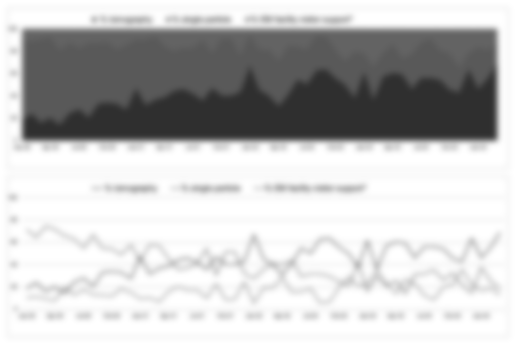
By applying these two quick tricks, it becomes easy to tell if the light-dark is high enough to distinguish the three colours from each other.
Use a tool to check your contrast ratio
There are also many tools that check how accessible the colour palette is you have chosen. One of them is the free contrast analyser by Adobe Color:
https://color.adobe.com/create/color-contrast-analyzer
With Adobe Color you can also easily create harmonic colour palettes out of photos!
Conclusion
Small adjustments, such as applying the right light-dark contrast in an intentional way, have a significant impact on making your message clear, legible, and striking.
More questions?
Let me know whether you find this article helpful, and feel free to send me any further questions you have on this topic or any other design topics you would like to be covered.
Dear Shau Chung,
There is so much I did not know. For instance, that pure colors, when viewed in three dimensions, come to the forefront. The graphic illustrates this very clearly.
I also wasn’t aware of the two simple methods for testing contrast; they are astonishingly simple. Thank you for the interesting article.
Warm regards,
Astrid
Thank you for your kind comment, dear Astrid! I am glad when it’s helpful.