How simplicity, clarity, and visual translation help shape real-world scientific impact
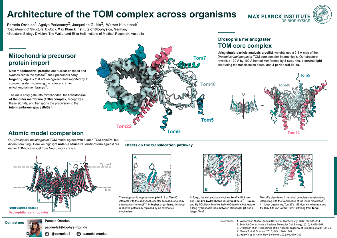
In my work as a science communicator, I have noticed that many scientific posters resemble papers pinned to a board—dense, overloaded with data, and hard to follow.
When I ask the researchers themselves what they prefer when they are the audience, they point to designs that are visually minimalist, bold and clear. Research confirms that preference: posters designed with a ‘less is more’ approach attract more attention and engage audiences far better.
Find out what the evidence says:
People Like What’s Easy
As mentioned earlier, when looking at other people’s posters, you can quickly tell which designs draw you in and help you easily skim the content: the ones with minimal text, bullet points, plenty of white space, and a clear, easy-to-read title.
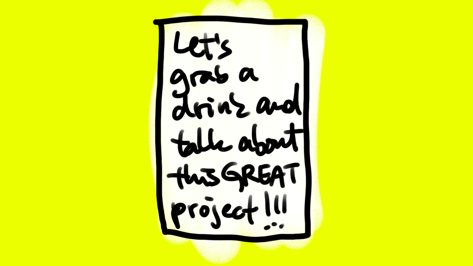
But when it’s your own research, it’s a different story. You’re naturally inclined to include as much of your work and findings as possible.
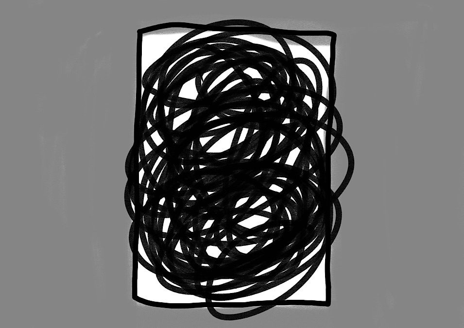
And yet, what feels like adding value can often have the opposite effect. The more we try to say, the harder it becomes for others to follow. That’s why it’s so important to step back and look at what actually works.
Research consistently shows that minimalist text and strong visual design increase a poster’s visibility. When you reduce clutter, you don’t lose content—you reveal it. It’s like a passepartout of an piece of art that helps you to focus and makes your content important.
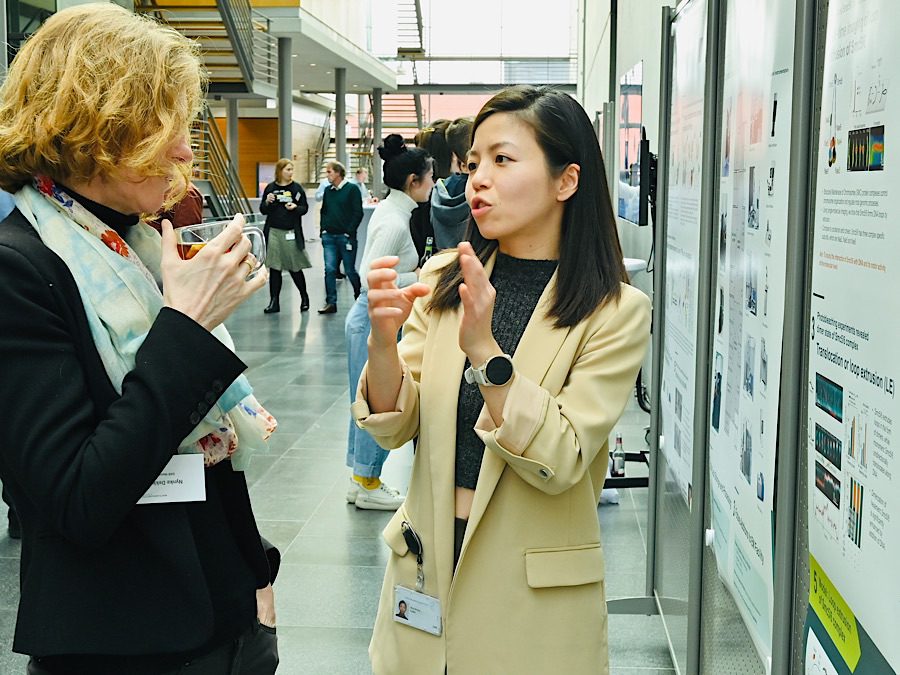
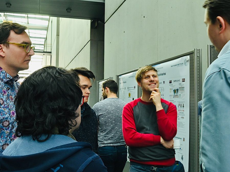
Posters Drive Conversations
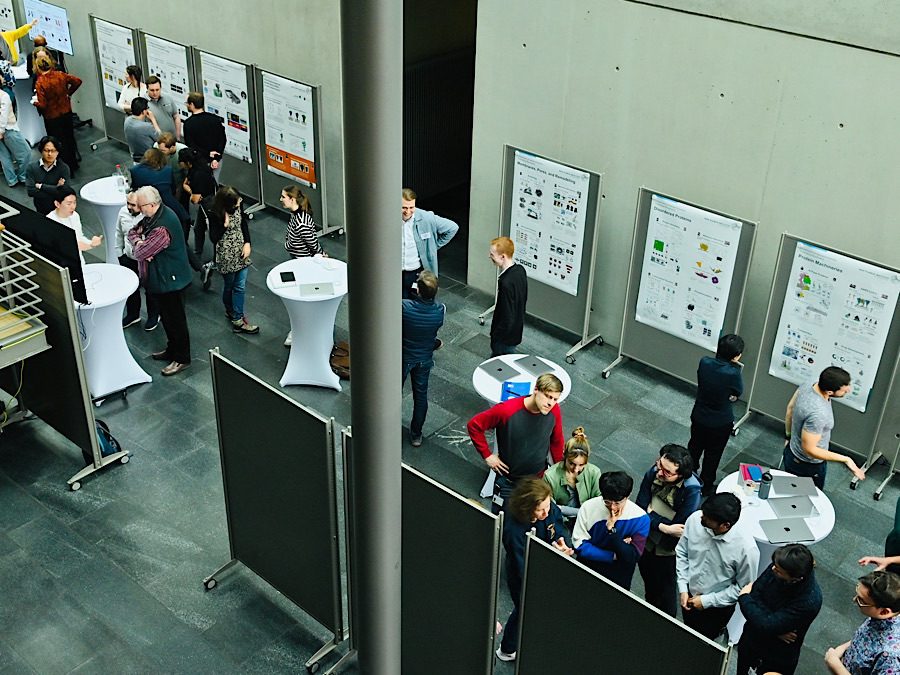
The first poster session I attended two years ago at my institute was a real eye-opener. Instead of being “just” a printed version of a presentation, I realized that posters were door-openers for fruitful conversations and hotspots for spontaneous exchange. I loved the party-like atmosphere of the event, and I could already sense how many collaborations—and even friendships—were being sparked that day. I found myself wishing we could have a poster session every week!
How to stand out in a sea of posters?
At a conference with 300 posters, however, the visual competition is more intense, and factors like your poster’s location, your topic, and the composition of the audience—all influence how many people you’ll actually talk to—especially those who are genuinely interested in your research topic.
While you usually can’t control where your poster will be hung, several other aspects are in your hands:
- Is there someone you’d really like to meet? Consider to send them an email in advance and ask to connect.
- Know that your target audience will be there? Design your poster with keywords in the title and figures that speak directly to their interests.
- And last but not least: make sure your poster stands out visually—bold and clear!
Getting noticed is the first step towards meaningful exchange. Easy-to-access posters naturally attract people, and this way lower the threshold for interaction. These posters act as teasers, creating inviting entry points.
While formal studies are still limited, the anecdotal evidence from researchers and design experts suggests a clear trend: better design leads to better conversations!
Design for Funding and Recognition?
Is there direct evidence that well designed posters land you publications and grants? Not necessarily, but they will bring more visibility to your research, which can lead to more trust—one of the crucial criteria beneficial for getting funds.
Even if you are at the start of your scientific career, you have plenty of possibilities to make yourself known—e.g. by giving talks, being visible online and at conferences. Creating a clear, condensed and visually attractive poster of your research will also provide you with material you can use for your presentation during talks and for your social media and web profiles.
Start building trust during the application process: a clear, easy-to-read grant proposal and a visually compelling, easy-to-grasp presentation don’t just make a good impression—they help convince reviewers that your project is both strong and relevant.
There is compelling evidence that visual design and visibility significantly contribute to building trust in scientific communication:
McKinley, Pandey, and Ottley (2025) explored how viewers’ perceptions affect their trust in data visualizations. Their qualitative study found that clarity, consistency, and design aesthetics significantly impact trust. They provided actionable guidelines for designers to create more trustworthy visualizations: https://doi.org/10.1145/3706598.3713824
Elhamdadi, Padilla, and Xiong (2022) conducted experiments demonstrating that visualizations with higher processing fluency—meaning they are easier to perceive and understand—lead to greater trust from viewers. Participants were more likely to trust and invest in information presented through clear, well-designed visuals compared to cluttered or camouflaged ones: https://doi.org/10.1167/jov.25.9.1847, https://arxiv.org/abs/2209.14340v1
Kurosu and Kashimura (1995) identified the aesthetic–usability effect, where users perceive more aesthetically pleasing designs as more usable and trustworthy, even if functionality is identical. This effect underscores the importance of visual appeal in establishing credibility: https://dl.acm.org/doi/10.1145/223355.223680
The Stanford Web Credibility Project found that nearly half of users assess a website’s credibility based on its visual design, including layout and color schemes. This reliance on visual cues suggests that well-designed visuals can enhance perceived trustworthiness.
These studies collectively suggest that investing in clear, aesthetically pleasing, and user-friendly visual designs can significantly enhance trust in scientific communications. Applying these principles to scientific posters can make them more engaging and credible to your audience.
Final Thought
The evidence is clear: clear, visual communication makes your science more accessible and credible. And when people understand and trust, good things tend to happen!
Design might not guarantee a result, but it creates the conditions for results to happen.
Lastly, the ability to summarize your research in appealing, concise terms that appeal to your audience is a superpower that will help you succeed in almost every aspect of your life.
So how do you break your research down into easy-to-digest chunks and delicious bites of information?
Join my training Poster Clarity!
Check out my Beginner Poster Design Course. In one day, I’ll show you how to design your first poster and make it easy for you to get started!
Email me for more information: mail@shau-chung-shin-not-ching-chang-chong.com
References:
- Perra, M., and Brinkman, T. (2021). Seeing science: using graphics to communicate research. Ecosphere 12(10):e03786. https://doi.org/10.1002/ecs2.3786
- Young, J., Bridgeman, M.B., Hermes-DeSantis, E.R. (2019), Presentation of scientific poster information: Lessons learned from evaluating the impact of content arrangement and use of infographics. Currents in Pharmacy Teaching and Learning, 11(2):204-210. https://doi.org/10.1016/j.cptl.2018.11.011
- Pedwell, R.K., Hardy, J.A. and Rowland, S.L. (2017), Effective visual design and communication practices for research posters: Exemplars based on the theory and practice of multimedia learning and rhetoric. Biochemistry and Molecular Biology Education, 45: 249-261. https://doi.org/10.1002/bmb.21034
- Arslan, D., Koca, T., Tastekin, D., Basaran, H., Bozcuk, H. (2014), Impact of poster presentations on academic knowledge transfer from the oncologist perspective in Turkey. Asian Pacific Journal of Cancer Prevention, 15(18):7707-11. https://doi.org/10.7314/APJCP.2014.15.18.7707
- Davis, M., Davis, K.J. and Wolf, D.C. (1992), Effective Communication with Poster Displays. Journal of Natural Resources and Life Sciences Education, 21: 156-160. https://doi.org/10.2134/jnrlse.1992.0156
I used to be a researcher in chemistry, long ago. And I remember the conundrum of adding enough info to a poster so that people get the message but not to much so as not to overwhelm the audience. In a way creating a poster is a great method of focussing your own thoughts on your research subject. Thank you for this reminder 🙂
Dear Angela, thank you so much for this very true thought! 😊